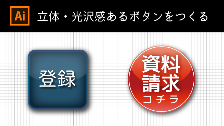
思わず触りたくなるような立体・光沢感あるボタンの作り方を紹介します。
メルマガやLP制作の時にちょっとしたアピールに最適です。
Contents
基本構造
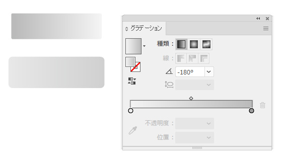
図のような左右陰影の違うグラデーションを用意します。
上はパスのオフセットで-10pxにしたものです。
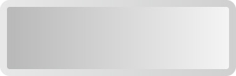
重ねるだけで立体的なアイコンが作れました。
基本的構造はこれだけです。
シンプル光沢ボタン
今度は90°グラデーションを明るめと暗めの2種類を作成します。
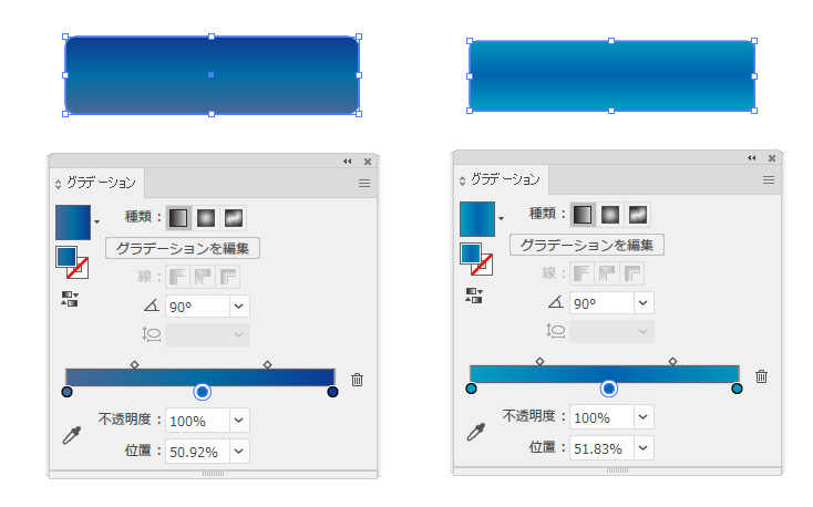
重ねます。
明るめの方を最前面に配置してください。
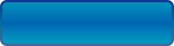
ハイライト(光沢部分)のオブジェクトを作ります。
ハイライト(光沢)をつくる
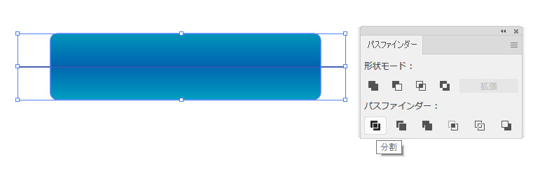
内側のオブジェクトを複製し、直線ツールで図のように線を引きます。
パスファインダーで分割します。(分割後グループ解除してください)
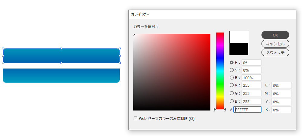
上の方を白へ色を変更します。(下のオブジェクトは消してOK)
ハイライトの配置が大事
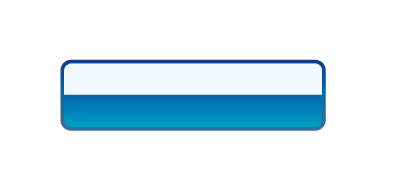
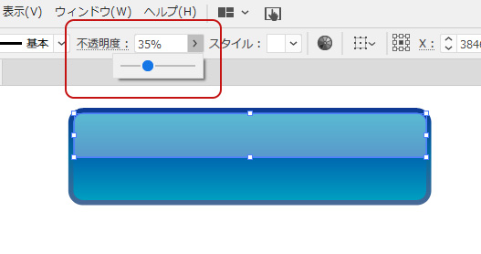
不透明度を下げ完成です。
光沢の配置にセンスが問われますね
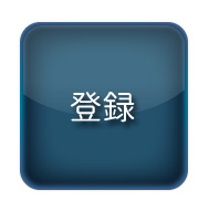
丸型ボタン
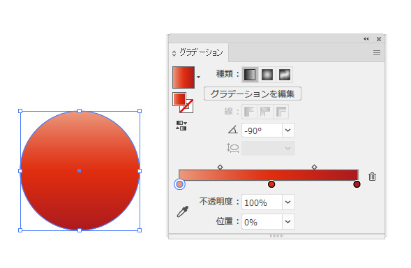
90度グラデーションで色をつけます。
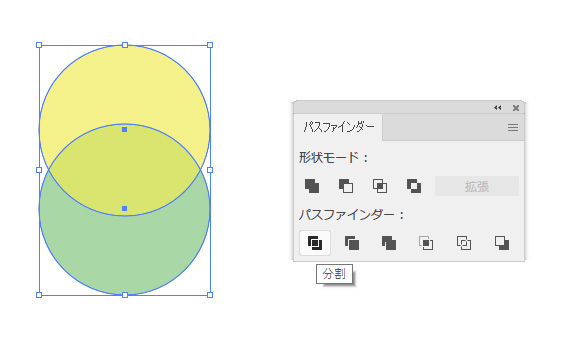
同じ円を重ね分割します。
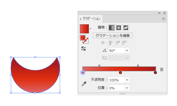
暗めトーンを上に90度グラデーションを適用します。
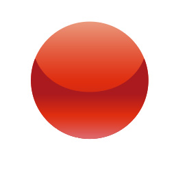
重ねて完成です。

文字を入れます。
視認性抜群ですね。LPにもってこいです。
ガラス風なボタンをつくる
[効果]>>[スタイライズ]>>[光彩(内側)]で立体的なボタン・シンボルが作成可能です。
背面・前面用オブジェクトを作成する
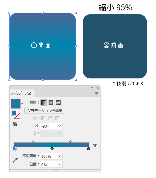
背面用と前面用のオブジェクトを作成します。
前面用のオブジェクトは複製しておいてください。
光彩(内側)を適当する
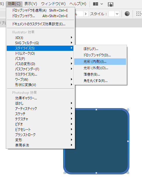
前面オブジェクトに光彩(内側)の効果をかけます。
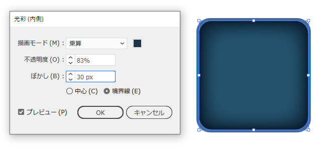
内側に影ができました。
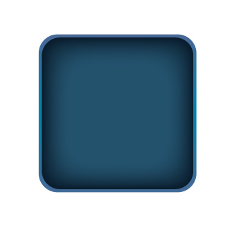
背面用オブジェクトと重ねます。
ハイライト用オブジェクトをつくる
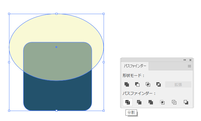
複製しておいた前面オブジェクトと楕円を重ねパスファインダーの分割を選びます。
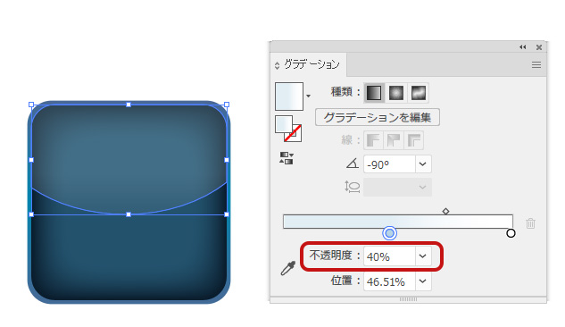
水色の半透明グラデーション(90度)をかけます。
ハイライトが完成しました。
仕上げ
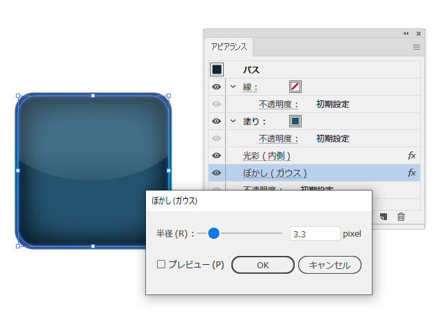
凹を和らげたいさいは[ぼかし]を控えめにかけます。
文字を入れ完成です。
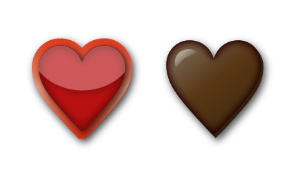
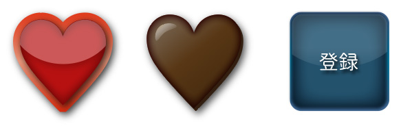
同じ手順でハートの形にも適当させました。
バレンタインのイラストに使えそうです。